Natasha Denona My Dream Eyeshadow Palette Review
- Best Foundation for Rosacea Guide - September 1, 2024
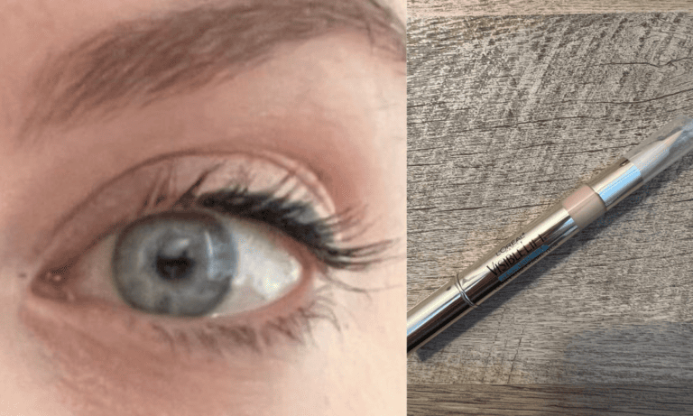
- Best Maybelline Mascara Guide: With 10 Recommendations on Which One is Best for You - October 7, 2023
- Tarte Primer Line Guide: Which Primer Won Us Over And Why? - September 28, 2023
- Bottom Line Up Front
- Features
- Pros
- Cons
- The Swatches (and My Thoughts on The Colors)
- The Test Look
- About My Skin and the Eyeshadow Testing Day
- The Performance
- Who It's Good For
- Who Should Skip It
- Alternatives
- Natasha Denona My Dream Eyeshadow Palette Review: FAQs
- Conclusion: I Hate to Say This, but Skip It
I couldn’t wait to write a Natasha Denona My Dream eyeshadow palette review when I saw the news of the upcoming launch. I ordered it during the Sephora sale right after the release, eager to have something new from one of my top two eyeshadow palette brands.
I’ve been experimenting with makeup and writing about beauty for decades. The Natasha Denona brand has been a consistent winner since I first tried it. Her other products are wonderful, but the eyeshadows excite me the most.
At first glance, I thought this palette looked perfect for me–some warm, but not too warm, browns and peachy tones, a deep brown and black, taupe, a little pop of gold, and some purples. “My Dream” really looked like my dream palette.
But…
Bottom Line Up Front
You Can See Where This Natasha Denona My Dream Eyeshadow Palette Review Is Going…
It wasn’t love at first sight once I finally got the palette, and I didn’t feel inspired to use it. Color combinations that would look good with my eye color and skin tone didn’t jump out at me.
I dove in with a purple look because those were the shades that grabbed my attention initially, even in the earliest promo pictures. That just made it worse. I’ll share the details later, but the shadows didn’t perform as expected.

Features
You get:
- Sleek, sturdy packaging with a matte nude finish and black accents
- 15 shadows (13 shades are new)
- A mix of finishes
- Quality ingredients, free of parabens, formaldehyde, phthalates, retinyl palmitate, oxybenzone, hydroquinone, sulfates SLS and SLES, triclocarban, triclosan
- A cruelty-free product
Pros
- You can create many different types of looks with this palette, from everyday light and warm to subtle daytime smoky, and even nighttime dramatically smoky.
- That multi-chrome shade makes the whole palette. It’s Vision’s palette; the other shades are just in it.
- I like the pops of bright color, like Instinct and Invention.
- The palette leans warm, but not so far that it wouldn’t be almost universally flattering on warm and cool skin tones, from fair to dark.
- Looks good with all eye colors
- Some shades are surprisingly rich, creamy, and easy to blend.
- They don’t seem especially fragile.

Cons
- Several shades (especially the deep plum) were disappointingly patchy, chunky, and/or sheer.
- Everything shows up warmer on me than expected.
- Some of the shades are interchangeable or at least so similar, other shades could’ve been put in their place, and no one would’ve missed them.
- This may be fixed now that the product’s been out for a while, but it bugs me more than it probably should that Spontaneous is misspelled on my palette.
The Swatches (and My Thoughts on The Colors)


First Row
- Blackest Black (matte) could’ve been amazing if it’d been creamier, but it’s a little dry and underwhelming if you want to use it as anything other than a liner. Even then, more pigmentation and a hint of creaminess would be nice.
- Aspiration (matte) is a cool dark brown with some of the same hang-ups as Blackest Black, but it’s less patchy and performs slightly better.
- Serenity (satin) is creamy and light-reflecting without noticeable shimmer (like a subtle metallic). It has a pinkish-red undertone, but it’s still a medium brown/almost taupe in my eyes. It looks warmer on my eyes and in the swatches than in the pan.
- Carpe Diem (matte) was surprisingly creamy for a matte. It’s a terra cotta shade with a hint of pink.
- Babies (metallic) is a pinkish-orange light brown with loads of shimmer (I know, that’s quite a description, but a lot is going on)
Second Row
- Instinct (cream powder matte) is vibrant and less dry than Edgy. It’s pinker and has more pigment than Edgy. It’s much bolder.
- Thrill (sparkling metallic duo-chrome) is a lighter, less pink, more shimmery, and patchier version of Babies. I’d use this one on top of other shades, patted on with a fingertip. It doesn’t stand alone on the lids very well.
- Unity (matte) looks a lot like Carpe Diem but is a little brighter, with less depth. It’s drier and patchier. I like it for diffusing edges on darker shades.
- Risk (metallic) is a deep bronze with reddish undertones. It’s smooth and beautiful, somewhere between satin and metallic. Still, this shade is in almost every neutral palette that doesn’t skew cool.
- Invention (sparkling metallic duo-chrome) looks like a bright, brassy gold in the pan but appears like an orange shimmer (warmer-toned than Babies) on the skin. I’d use this as an accent on the lid with another shade under it because I can see my skin through the shimmer, even in the swatch applied with my fingertip. The chunkier texture that creates the uneven coverage could have been an intentional choice (if it was meant to be used as a topper shade), but it looks patchy. It was easy to apply and felt creamy, so it’s confusing.
Third Row
- Vision (multi-chrome metallic) is the stunner of the whole palette and the reason I was so drawn to it in the first place. It looks like a more shimmery Serenity in some light, but it’s a violet-green duotone, and I live for shades like this. It’s creamy, shimmery, and mesmerizing, even on lids–is it green? Violet? Gold? I wish I could capture it better in the swatches.
- Edgy (cream powder matte) is the biggest disappointment, as purple shadows often are (very few makeup brands can get purples right). It’s a sheer, bright, medium purplish-pink that’s almost impossible to blend. Mixing it with black can help, but I wanted it to stand alone as a gorgeous, deep plum, how it looks in the pan.
- Spontaneous (metallic) is a creamy, metallic delight to apply and will work well on the lid or as a highlight shade. It’s light gold with a warm undertone. I detect a hint of pink in there, too. It’s smoother than Invention and less pink than Babies. The texture is similar to Babies’.
- Nurture (matte) looks like a matte, light-medium neutral brown in the pan, but it pulls slightly warm on my cool-toned skin. It’s creamy, especially for a matte. I like this one in the crease and as a light liner under my bottom lashes.
- Familia (matte) is a deeper terra cotta/reddish-brown than Carpe Diem, but the finish and performance are the same. Carpe Diem is brighter, but they’re almost interchangeable. It’s more matte and has fewer plum tones than Risk.
The Test Look
I wanted to make sure the purples were showcased in this look since they were a big draw for me when I decided to buy it. The black was, too, so I used that as well. I was careful to keep my upper lid area free from concealer and color corrector because I know those can cause creasing.


- Carpe Diem in the crease blended up and out
- Instinct to deepen the crease (I forgot how pigmented this one was and got too much on my brush, so it’s a little intense, but I just went with it)
- Nurture on lid
- Edgy on the outer corner, which had to be deepened with Blackest Black (both are kind of patchy and hard to blend)
- Edgy along bottom lashes (it worked better there than it did on the outer corner)
- Unity blended along the edge of Carpe Diem in the crease and Edgy on the lower lash line to soften the lines
- Blackest Black to line upper lash line (no additional liner was used this day)
- Vision, patted in the center of the lid with a fingertip (ring finger for a light touch)
- Spontaneous on the inner corner for brightness
Another one of my favorite looks to do for everyday wear is simple compared to that one:
- Nurture in the crease blended out and up
- Serenity on the lid
- Aspiration in the outer V
- Nurture and/or Aspiration to lightly line lower lashes
- Optional: Blackest Black to line upper lash line

About My Skin and the Eyeshadow Testing Day
My Skin and Eyes
I have dry-normal skin. My eyes are sensitive and often itchy because of allergies. The day I set out to test the Natasha Denona My Dream palette for this review and take pictures, they somehow managed to behave (thank goodness!). They didn’t itch or water.
I have horrendous circles under my eyes that I try to cover up, but some days are worse than others. I made a special effort to keep those products off my upper eyelids on testing day. When I applied my eye products, I just used a primer on clean, dry skin, then put the shadows on top of that.
Since my eyes are blue and my skin tone is cool-neutral, I gravitate toward bronzes that aren’t too red, golds that aren’t too yellow, neutral browns, taupes, pinks, and purples where eyeshadows are concerned. That’s why I thought this palette was a must-have for me.
The Weather
I officially tested this on a hot, humid July day. However, I’ve worn it in all kinds of weather. The results weren’t that different in July than they were in January or April.
What I Did
After applying foundation, color corrector, and concealer (around my eyes, but not on the lids), I used Urban Decay Primer Potion. My bathroom was hot and humid, and applying makeup felt like a lost cause.
I’d already gotten my workout done early and had no errands other than picking my daughter up from school, so it was a relaxed day for an eyeshadow palette test.
Besides that, I worked at my desk, made lunch and an afternoon Chemex, and went about my typical day.
Other Products Used
I used the same products I usually do: the pink Urban Decay color corrector that’s now discontinued, NARS Radiant Creamy Concealer, and Urban Decay Primer Potion (sometimes I use Too Faced Shadow Insurance, but they seem to perform the same on me these days). I skipped my usual black liquid liner to try the black eyeshadow in the palette in its place. My mascara was Tower 28 MakeWaves.
The Performance
The Application and Blending
These shadows are hit or miss. Some feel almost buttery as you apply them (and some are–shockingly–mattes!), while others are patchy, sheer, dry, and nearly impossible to blend. Some were richly pigmented, while others made me wonder if I got a defective palette.
Sometimes, shadows will stick when hitting the primer. They’re locked into place almost as soon as you put them down. I experimented with two primers and even tried putting another shadow down before the trickier shades to see if that would make blending easier, but it didn’t matter. The deep purple and black shades were always patchy unless I used a tiny brush and applied them as liners.
Depending on the shades I use, this palette can take more work than I ever want to put into an everyday eye look. I’ve tried too many amazing palettes, and now I’m spoiled because I know how eyeshadow can perform. I may need to keep a sticky note on the outside to remind me how the different shadows behave (and which ones look warmer on my skin than in the pan).
There wasn’t a lot of fallout, though, which was nice. There were a few specks of black shadow on my cheeks and under my eyes, but that’s about it. Black eyeshadows usually make a bigger mess, so I can’t complain.
The Wear
Sometimes, the shadows from this palette make my eyelids feel especially dry. So far, I haven’t had any issues past the feeling (no rash, peeling, or other skin concerns once washed off). Simpler looks cause less of an issue, but anything more dramatic can get borderline uncomfortable at times, though it’s never been enough for me to go back and wash it off before it’s just time to wash my face anyway.
So. Much. Creasing.
I didn’t do any workouts and was barely outside in the heat and humidity while I had this eyeshadow on. I’ve worn these several times before, and the creasing annoyed me, but I thought I might’ve gotten concealer on my lids before I applied it. This time, I was careful not to do that, even going back with a sponge to pat down the excess concealer under my eyes that I’d usually just spread onto my lids to help hide discoloration.
I’ve used these shadows with two primers: Too Faced Shadow Insurance and Urban Decay Primer Potion (Original). They crease every time I wear them, hours sooner than most other eyeshadows (even other Natasha Denona ones).


Did the Colors Fade?
Where I didn’t have creasing, the colors were still going strong at the end of the day. They hadn’t faded much at all.
Who It’s Good For
- Natasha Denona eyeshadow palette collectors
- Someone looking for a neutral palette with a mix of finishes and a couple of exciting shades to mix things up
- Someone who enjoys everyday looks with a pop of something extra, with the potential to create smoky looks out for evenings or special occasions
- People who can’t get enough warm tones but are over the full-on reddish-bronzes and orangey-golds
- Someone who’s a sucker for a good duo-chrome shade and content with a palette that comes with a handful of other standout shadows amongst several average ones (and a couple of duds)
Who Should Skip It
- Someone who loves purple/plum eyeshadows
- Someone who already has a good neutral palette that leans slightly warm
- Someone who prefers barely-there makeup looks (you can do those with this palette, but it’s not the best choice if you’re looking to buy something new)
- Someone new to the Natasha Denona makeup brand
Alternatives
Natasha Denona Glam, Retro, or Bronze
I’m listing all three of these 15-pan palettes under the same heading because they all have high-quality shadows in a mix of finishes but achieve different results. Based on what attracted you to the My Dream palette, choose Glam (for cool shades), Retro (for plums and pinks), or Bronze (for warm tones). The Retro palette seems a little drier than Glam or Bronze, but the application and wear still outperformed the My Dream palette on me. These all apply effortlessly, blend without much effort, and last all day on me.
Tarte Tartelette Juicy Amazonian Clay
You might like this one if you love rosy palettes with some warmth and warm browns, but you don’t necessarily need the duo-chrome or dupes for the darker plum or black shades. It has the same vibe, but lighter. There are only 12 shades here, and some are similar, so that might be a drawback for some people. This is a more wearable palette overall.
Even though the Natasha Denona palette has cool-toned shades, they still look warm on me, so opting for this one instead of My Dream is not necessarily a loss. If your coloring is the same as mine and you like warm tones, this one might fit the bill.
Anastasia Beverly Hills Soft Glam
Anastasia Beverly Hills is my other favorite brand for eyeshadow because they’re highly pigmented and extremely smooth. Soft Glam is a must-have for people who like palettes with warmth, pink tones, and a black shadow that can be used in dramatic looks or as eyeliner.
These colors are more muted, but you’ll still get the peach and pink tones, plus reddish brown and black.
Be warned that a few of these shades look similar (which seems to be a common issue with palettes lately), so if you don’t love the golden shadow shades, you may still want to look elsewhere.
LORAC PRO Palette Noir
With all the Natasha Denona and Anastasia Beverly Hills releases over the past few years, I’d forgotten about LORAC Pro, but their shadows are almost on the same level–at a much lower price (about $30.00 cheaper). The Noir palette has 18 shades, including a deep violet and reddish plum. These are less warm-toned overall, which I prefer. They’re closer to neutrals. You’ll still get a mix of shimmers and mattes. The only thing you’ll miss out on is the magic of the violet-green shade. Again.
About That Killer Multichrome Shade (and the Plum)
I have bad news if you were interested in the multi-chrome violet/green shade. That one’s difficult to find a dupe for, and even harder to find in another palette. However, you might like the L.A. Girl Shifter Duo Chrome Powder Eyeshadow.
As for the deep plum (that didn’t turn out to be a deep plum at all), consider Sydney Grace’s Awake.
Natasha Denona My Dream Eyeshadow Palette Review: FAQs
Question: How much is Natasha Denona Dream Palette?
Answer: As of this writing, it’s $69.00. If you’re a first-time shopper on the Natasha Denona site, you will probably see a pop-up offer to join the email list and save 15 percent on your order.
Question: Is Natasha Denona eyeshadow good?
Answer: I love almost all of them. I buy the mid-size palettes because the larger ones cost more than I usually want to spend on a palette, and storing and traveling with them can be tricky.
Question: What is Natasha Denona famous for?
Answer: She’s been a makeup artist for more than 20 years and has created a brand of makeup known for its high-quality ingredients and excellent performance.
Conclusion: I Hate to Say This, but Skip It
Natasha Denona is one of my favorite brands, and these are some of my favorite types of colors to use. The initial application of the shadows (with a few exceptions) is beautiful.
Sadly, it disappointed me because of the patchiness of some shades and the creasing I get/got. I’d recommend choosing the Glam, Retro, or Bronze palette over this one if you want to try the Natasha Denona brand.
Some colors applied and blended like, well, a dream. But there were too many disappointments or lookalikes for me to recommend this one wholeheartedly.